« Who was the mysterious fortune cookie king? | Home | Fortune Cookie Chronicles-inspired art »
Print Magazine: The History of a “Racist Font”
By Jennifer 8. Lee | October 14, 2008
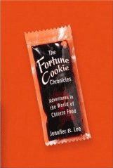
Print magazine had an article by Paul Shaw on ethnic fonts (It ran in August but I’m just getting to it now), which highlights the history of the ching-chongy chop suey fonts — which had become synonymous with Chinese restaurants during the first half of the 20th century. This is of particular issue to me, as one reader once wrote, “Angry Asian Man has criticized others for using the pseudoâ€Chinesey†letters like your Fortune
Cookie Chronicles heading. How about the actual Chinese characters with the English translation in parentheses underneath.”
Now as I have said, the book is about Chinese-Americanness and the font is supposed to be Chinese-American, not earnestly Chinese. In fact, one of my first concerns was that the font wasn’t “ching-chongy” enough because it had to do both lowercase and uppercase.
As I traveled across America, I found the font is still visible on Chinese restaurants from an earlier era, mostly in smaller towns and cities. Seeing these restaurants called up a nostalgic Happy Days-feeling.
As Paul Shaw writes:
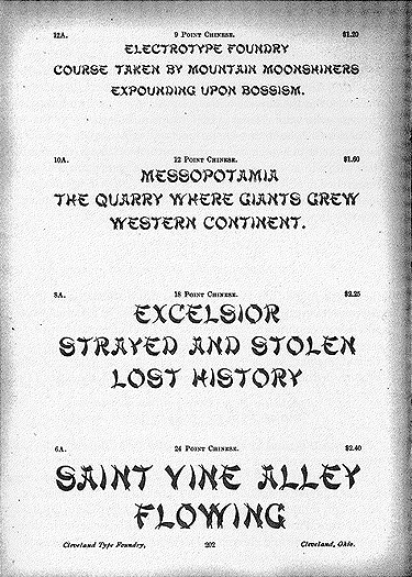
The one 19th-century face with an unmistakably Asian name and a suggestive appearance is Chinese (Cleveland Type Foundry, 1883). Known since the mid-’50s as Mandarin, the face is characterized by curved and pointed wedge strokes that superficially resemble two of the eight basic strokes of Chinese calligraphy: the downward left stroke and the upward right stroke. Unfortunately, the strokes, forced onto the armature of Roman letters, are assembled in a manner that completely ignores a calligraphic emphasis on structural balance and harmony.
Mandarin is the granddaddy of what have come to be known as “chop suey†types. It’s a fitting name—just as chop suey is an American invention, so, too, are the letters of Mandarin and its many offspring. Neither the food nor the fonts bear any real relation to true Chinese cuisine or calligraphy. But this has not prevented the proliferation of chop suey lettering and its close identification with Chinese culture outside of China. Mandarin was used by the Beggarstaff Brothers (William Nicholson and James Pryde) for their 1899 poster “A Trip to Chinatown.†The poster was included in Les Maîtres de l’Affiche, the enormously influential monthly publication showcasing the most beautiful posters of the fin de siècle. By the end of World War I, chop suey lettering had become synonymous with San Francisco’s Chinatown. This may have been due to the influence of the Beggarstaff poster, or it could have been a way to distinguish the rebuilding of Chinatown as a tourist destination following the 1906 earthquake. The new Chinatown was flamboyantly, theatrically “Chinese,†complete with pagoda roofs and other exaggerated and stylized details.
Historians have noted that before the earthquake, San Francisco’s Chinatown was just more or less just wooden shacks, which is why it was flattened during the earthquale. But it was not architecturally “Chinese” until it was rebuilt, where the residents saw tourism as a means to revive Chinatown’s economy.
He continues:
By the ’30s, chop suey letters were being used to promote Chinese restaurants across the country. Chop suey, the dish, invented 40 years earlier, had become a culinary craze. Restaurants responded by including the dish in their name and emphasizing it in their signs and advertising. This can be seen in surviving neon signs—Guey Lon Chop Suey Restaurant in Chicago, Pekin Café Chop Suey in San Diego, and the Joy Young restaurant in Birmingham, Alabama—as well as in postcards and matchbooks from the ’30s through the ’60s. The oldest of these neon signs have sans-serif lettering and are as reminiscent of Morris Fuller Benton’s Hobo (American Type Founders, 1910) as much as other chop suey styles. When chop suey letters do appear, they tend to be rounder and blunter than later iterations of the style and with less overlap among the strokes. The more familiar, and sharper, look is a post–World War II phenomenon. Ironically, it was Chinese-American restaurateurs who were choosing the chop suey lettering (and serving the dish), conferring a bit of authenticity on two American inventions.
So that’s an important point, it was not as though Americans were imposing the font on the Chinese. It was the entrepreneurs who were choosing it, as it was an efficient (and cheap) way to say “Chinese” without pagodas and dragons.
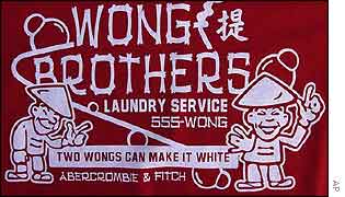
It’s more problematic, let’s say, when a company like Abercromie & Fitch decides to use a Chinese-y font, as they did in their T-shirt “Two Wongs Can Make It White.”
Topics: Chinese | No Comments »
Comments are closed.


