« Fortune Cookies are really from Japan. | Home | Booklist Review: More a summary than a review »
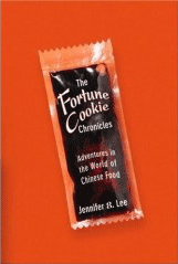
The cover design for fortune cookies.
By Jennifer 8. Lee | January 17, 2008
I woke up the morning my fortune cookie story ran with emails from friends that were like “awesome layout” and “great design.” As I had waited until late for the story to go online and read it only online, I had no idea what they were talking about. I actually didn’t see the paper until almost 11 a.m. after I was coming back from an assignment and found a copy someone had left in the subway.
And it really was amazing. Above is lovely fortune cookie front on the Dining section cover. The layout, which has gotten lots of compliments, was all the idea of the art director, Nicki Kalish. They had little strips of paper photographed in the studio and then she arranged them on the page. The type was helvetica regular, a sans serif font that resembles a common fortune cookie style.
But the rest of the article got split from this artsy part. So every time they made a change in the pre-jump text (“generations-old” as opposed to “centuries-old”), they had to have the art processed again, which is why the editor, Pete Wells, kept hounding me for changes. More so than normal editing process.
Topics: Chinese Food, Fortune Cookies | No Comments »
Comments are closed.

